
Nervous System Gets UnGRIDDED: A New Series of Coloring Books and Notebooks
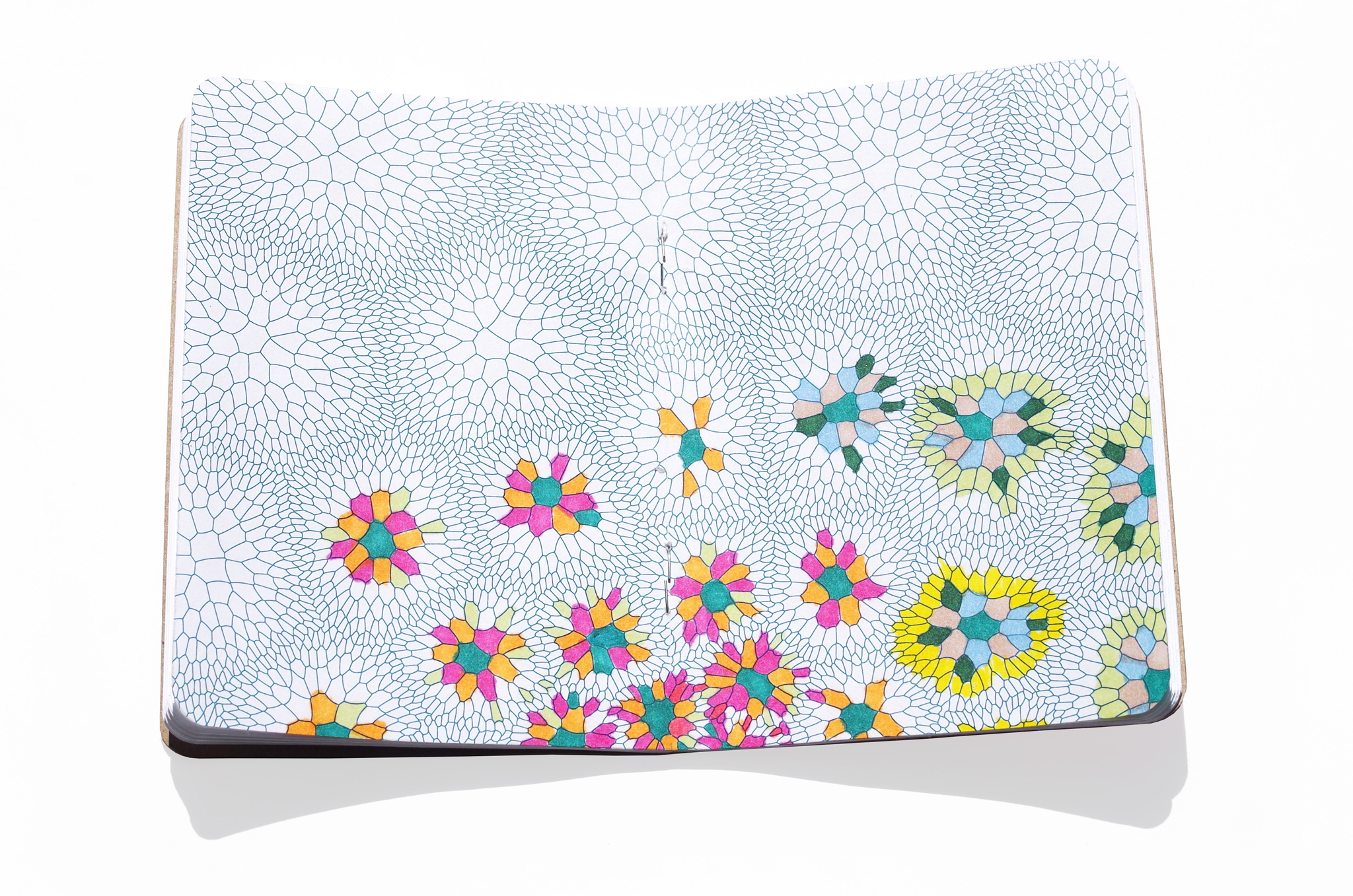
We’re excited to announce the Kickstarter launch of UnGRIDDED, a new series of coloring books and notebooks created by our friends at AMINIMAL…
We’re excited to announce the Kickstarter launch of UnGRIDDED, a new series of coloring books and notebooks created by our friends at AMINIMAL…
Today I watched Rivers and Tides, a film about Andy Goldsworthy. I’ve been putting off watching it for several years now, but when…
We were invited to SIGGRAPH this year to be artist’s in residence in the studio. Two of the other AiR’s were David Bowen…
Thursday night, Jesse and I went to see the Murakami exhibit at the MOCA Geffen. At the time something about the exhibit rubbed…
http://www.friezeartfair.com/podcasts/details/custodians_of_culture_schoolyard_art_playing_fair_without_the_referee